Share
How to Build a Blog
The Design
The branding and product design
On Design
Design is everywhere. It's in the curvature of the chair in your living room. In the stone arches seen at the entrance of a building. Woven in the threads of the shirt you're wearing. Sitting in each letter of this sentence. It's why I find it to be such a rewarding career—there are endless amount of things to learn and so many different applications. That being said—since designing in the digital world is what I do for a living—sometimes it's hard to muster up the desire to spend more time designing during my spare time, I do have a lot of other hobbies after all. When working on many of my side projects, I definitely don't spend enough time in this space. It's usually all in my head, and I'm just eager to get the thing out into the world.
I still really enjoy the process and still have a lot to learn—so in the name learning, I'll capture some of my process at a high level, and in the future maybe do some deeper dives for each specific area.
For the launch of the blog, there were two main aspects of design I wanted to parse out:
Branding
- Brand strategy: the thinking around how you want your brand perceived AND how it is actually perceived
- Brand execution: what you probably think of as branding—the logos, the colors, the name
The product design
- The overall experience and how everything works, along with the unique features that differentiate it from other products
- The system of what makes a website function and look good—sizes of the headlines, body copy size, buttons, input fields, so on and so forth
There is a lot that goes into each of these buckets—and you certainly can spend many months on all of this. Though to kick things off as a personal project, I tried to just do what I needed to in order to launch the thing I wanted. There's always time to go back and rework.
The Brand Strategy
First comes the strategy. I've recently ran a couple of brand strategy workshops with some friends' businesses and found the process to be really fulfilling. Depending on where in the brand lifecycle you are, what you need out of a strategy session will be different. In all of the cases—friends' businesses and A Month Learning—we were in the early stages of branding and in building an audience. To me, this is prime time to really just wrap your head around how you want to start putting yourself/business/product out into the world. The inventors of the Design Sprint from Google Ventures wrote a great article about using a similar (super trimmed down) version of a Design Sprint to quickly get started on your brand.
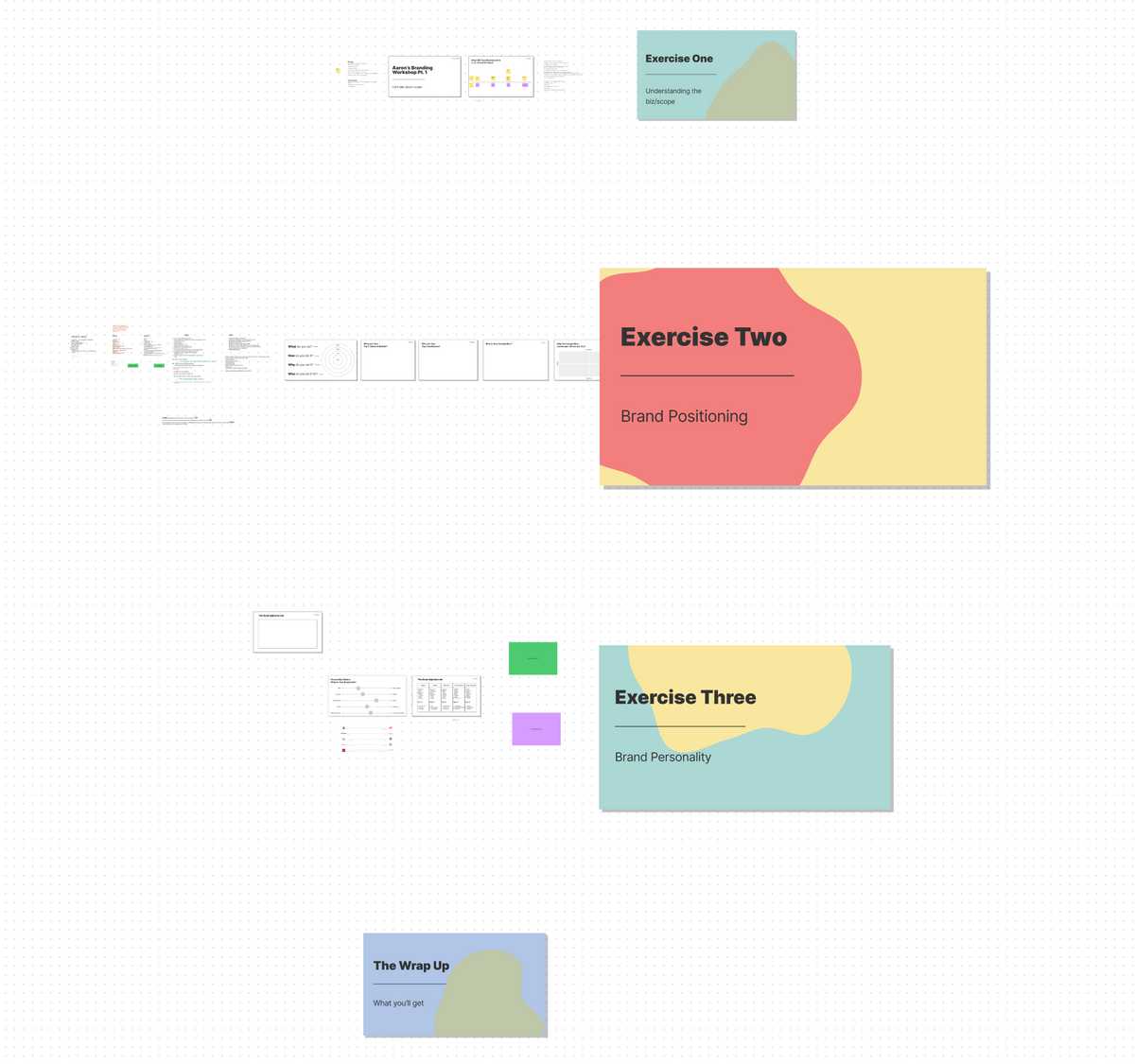
This type of structure can be helpful to focus your thinking around what you're really trying to do and how you want come across. For A Month Learning, I roughly followed some of the ideas in that article and ran through these three exercises:
Scoping & Understanding: what the thing is and current scope of where I want it to go. Starting to understand my short term plans (start writing about everything I'm learning and have fun doing it), and long term goals (inspire people to get out and start doing, having guest writers, interviewing experts on the most effective way they learned something).
Brand Positioning: capturing the what, how, and why you're doing a thing, along with who you do it for. Once you brainstorm a few ideas in each of these sections—you write it up into a nice little statement that sums up what every touchpoint of your brand should try and accomplish. The statement reads something like:
I help (audience/user/community) to (what you help them do or with) by (how it is you actually help) that (the why). For A Month Learning it was something like "I help curious creators to see their own projects come to life by providing inspiration or tangible resources that helps the world get out and start making more stuff. Pretty big stuff.
Brand personality: this is the, well, personality of the brand. If your brand was a person, what traits would it have? Would it be fun? Serious? Trustworthy? In the case of A Month Learning—I really wanted to capture playfulness, easy-going vibes, and excitement. It is supposed to feel welcoming and inspiring. Every design decision should try and capture that as best as possible. You can explore the personality through exercises like brain dumping adjectives that fit the mold. Or by creating personality sliders that compare two contrasting adjectives and you decide which word your brand is closer to on a sliding scale.
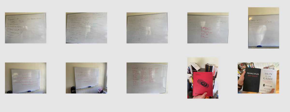
Here are some screenshots of how I ran similar workshops (remote and in person) with entrepreneurs and close friends Aaron Walters and Justin Mulvaney. These are just a few examples of what the above exercises can look like in practice.


There is a really neat documentary series from The Futur about building a brand that has some great nuggets spread throughout. I also recommend their course on Brand Strategy Fundamentals created by Brand Strategist Anelli Hansson. There's more information in this course about conducting audience research which is obviously important when you're thinking about brand perception.
Since this isn't quite at the stage of having any readership and more of an MVP, I largely did the exercises based on some assumptions and took some creative liberty.
Based on the outcomes of the above exercises, the next part is the execution. Brand execution is probably what you think of when you think about branding. The logo, the graphics you see on social, typography, colors, etc.
The Brand Execution
The strategy is ironed out. Great. Now what? Well, now we can start getting into some of the more fun design-y assets that will make the strategy come to life. Think the brand colors, the logo, typography, social media assets, language and grammar, really anything that is out in the world that someone will interact with. Whatever that thing is, it should track back to the positioning statement about how you want people to feel/act/experience your brand.
For me personally, I don't really have a great system or process as to how I work through brand execution. It's usually just off the cuff brainstorming, using the strategic stuff to come up with overall vibe & capturing metaphors visually where possible. It all can be pretty subjective.
Based on my strategic work—I knew I wanted A Month Learning to feel playful, have a casual tone, be inviting and overall be digestible. Some of that gets conveyed within the product itself—which I'll get into—but for the brand and visuals, I really settled on the playful and inviting vibe. I'll quickly touch on the thinking behind how I landed on the colors, the typography, and the logo that I believed would capture those feelings.
The colors: I always love experimenting with color when I have the chance. It's such a tough thing to really nail down. I didn't want to overdo it and I didn't want anything super vibrant, but I also didn't want the feeling to be dull. Thinking of mediums in the physical world that do this really well—I couldn't stop coming back to pastels. Pastels are really just adult crayons when you think about it. I feel like the internet doesn't have enough of the softness of pastels. How I landed on the vibrant green? I wanted to represent growth. Trees and plants grow. Most trees and plants are green. Green it is. As far as a defined color palette, there are plenty of systems and methods to produce psychologically pleasing ones. That's a topic to dive into a different month, but for the sake of finding something that looked good and worked I just used this super handy tool called Coolors. Either plop in the hex code of the color you're certain of and just keep on clicking until you get smacked in the face with excellence, or explore a boundless number of predefined palettes.
The typography: Since this is a blog about building stuff, I wanted to imitate the feeling of building blocks. The two fonts I chose—Kollektif and Montserrat are very geometric. Finding type parings is super difficult. There are so many type foundries that spend their entire lives dedicated to parsing out perfect typefaces. The brand strategy really helps here when you try to find a typeface that has a personality. For a great resource about font pairing and just exploring the world of type in general, I always jump over to Typewolf to get the latest.
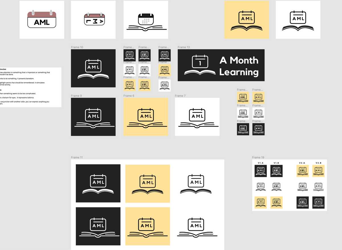
The logo Logos are hard. Yeah, sure, "good" logos aren't literal. They're a tool for identification not communication. Sagi Haviv talks about it in depth here. But this is supposed to be fun and I can do what I want. It's a book with a calendar. It's A Month Learning, what more do you want from me.

There is obviously more to each of these buckets—but for the sake of your attention span I'm trying my best to be succinct and give you the resources to explore yourself. If you're interested in learning more or chatting more about any one of these, my DMs are open.
The last part of the design is the website and how everything functions and scales.
The Product Design
Product design is really designing the individual pieces, like legos, that you use to build up the entire experience. You have buttons, you have different sizes of headings, you have input forms, you have colors. You use all these things to build tiny components that inevitably build an entire thing. It can be a very systematized process. Brad Frost wrote about a great way of thinking about web design called atomic design. In my experience this is such a powerful way to think about design in general, and I might even go as far to say it's a good way to think about anything. It really bridges the gap into engineering to help build the mental models of how everything works.
Enough with the lecture, you're here for how to build a blog, not how to product design. Or maybe you are here just for product design. Who is reading this thing?
Sprinkling some of the thinking above, here are some of the other things I wanted to capture in the experience:
- I wanted the design to feel playful. When kids learn they are experimental and conveying information to them is largely a playful activity. I wanted to apply the branding to the product so it feels that way when you use it.
- I wanted to actually provide useful resources, tools, and realistic breakdown of costs. There should be some sort of component for the blog to share all of this.
- I knew it was going to be a blog, so it would be text heavy—how can I make the reading experience enjoyable and not too cumbersome?
- Can I make the website flexible enough to adapt to components and features that I might need in the future that I don't know about yet?
- How can I easily convey what a post is about? What kind of stuff you're getting into?
Research is a huge part of this process, because these tiny pieces all have specific types of interactions that either map directly to people's mental model or they need some sort of guidance about how to use the thing. Using too many unfamiliar patterns can really break a digital experience and make people frustrated. A classic book that seems like common sense to some called Don't Make Me Think really captures what a digital experience should accomplish. Even though I just told you not to think, think of the last time you tried to click on a button that didn't work. Or the last time you tried to accomplish a task on an app and it didn't do the thing you expected. This is where research and testing can help figure out the pain points.
That being said, I didn't do any research. I just wanted to build something.
The product design process generally also includes iterating with wireframes to figure out functionality. When you have some initial research done and a direction to take, you can start using rectangles (sometimes circles, but mostly rectangles and rounded rectangles) to convey ideas of how a product might work. You then can use those wireframes to get a better idea of how a final thing might look, and you can do some usability testing to make sure what you're scheming matches with how people in the wild would use it.
That being said, I didn't do any of that either. My god, what kind of designer am I.
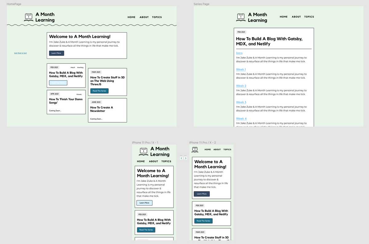
As I mentioned I don't spend enough time in this world in general for my side projects, we all have room for growth. Most of these concepts and ideas were in my head and I knew exactly how I wanted to build this thing out. So as far as style guides, a design system, and hi-fidelity mockups, there are very few of those artifacts I can share with you right now. They also are all really in depth topics and areas of expertise that could use an entire month themselves. So for now, you can see the little bit of design work I did before I jumped into the build.

What else didn't I do?
Sheesh, let's take it easy with the criticism, okay? Making stuff is hard. But there is just one other thing about the design I want to address that you may notice are lacking: There aren't really a lot of photos. This is both a branding and a product thing. Finding out the style of imagery for a brand is a whole other thing to tackle. Then making sure that those images are visible on a variety of devices AND making sure they help the experience is also another problem to solve. So for now, we mostly just get me writing until I get a better grasp on those.
Success metrics
How will I know if the design of this blog is successful? As an MVP it really just needs to be functional, easy to navigate, and fun. Since I don't know who the audience will be for this other than myself and a handful of friends and family—the initial goal is just to be a house for my learnings, resources, and tools.
Onward to the build.
Previous Post
Next Post
The Build
- The Three-Hour Brand Sprint
- Brand Sprint Template for Figma
- Building a Brand documentary
- Brand Strategy Fundamentals course
- Typewolf
- Atomic Design
Resources
- Figma — $15/mo (Free to get started, I just pay for more features)